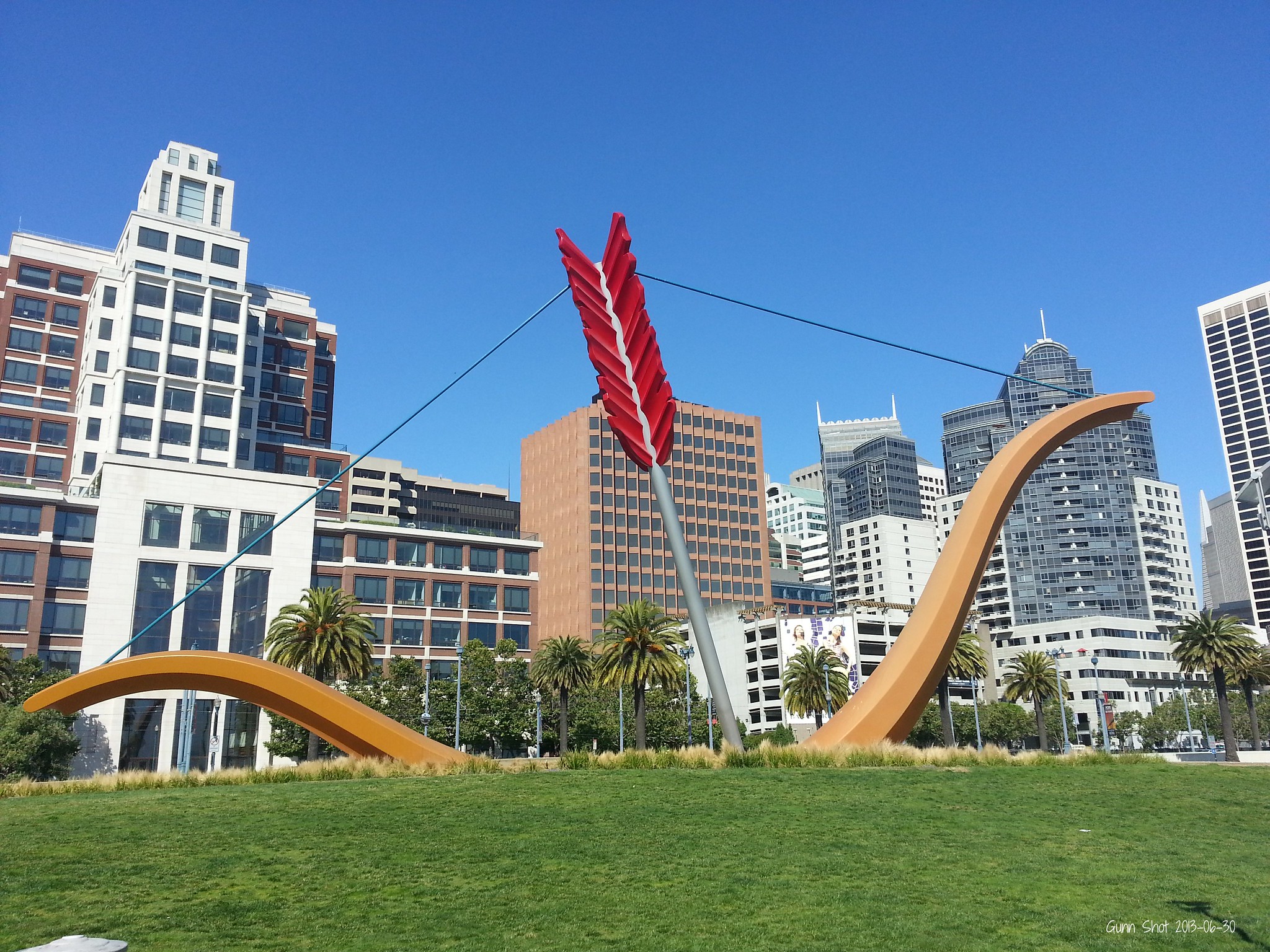
The news broke this week that Claes Oldenberg, one of the artists behind Cupid’s Span, the roughly 60-foot bow and arrow sculpture along the Embarcadero a few blocks from the Bay Bridge, had died at the age of 93.
Although Oldenberg was acclaimed during his lifetime, and Cupid’s Span is reminiscent of much of his best work, the installation has always been…polarizing. One man-on-the-street interview in 2002 dubbed it, “The stupidest thing I have ever seen.”
Of course, this is hardly surprising: Anything new in San Francisco is likely to provoke hostility or befuddlement at the time. Often, public outrage at new buildings or public art cools as decades pass; in other cases…well, let’s give it another generation.
With Oldenberg’s legacy on our minds, let’s solve some of the mysteries around the most divisive edifices in all of San Francisco, in hopes that future critics will a bit more sympathetic toward artists’ intentions.
***
The Transamerica Pyramid
We’ll start with an easy one: Everybody takes the towering, semi-triangular silhouette of this downtown tower for granted now, but in 1972 one famed architecture critic dubbed it “hideous nonsense” and a leading example of “the taste of tastelessness.”
Mayor Joseph Alioto basically bullied city planners into allowing the pyramid project to go forward. So, Why Does It Look Like That? Well, the distinctive triangular profile was actually a concession to critics, as the narrow point up top cast a more slender shadow on neighboring blocks.
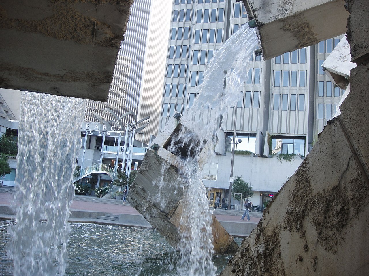
Vaillancourt Fountain
Québécois artist Armand Vaillancourt designed his twisted fountain as an ode to, of all things, the Quebec independence movement.
So, Why Does It Look Like That? Well, without getting into the history of Brutalism and Vaillancourt’s personal politics, one thing modern observers don’t realize is that the installation was meant to distract from the nearby freeway, itself a horrifying eyesore.
What freeway, you may ask? That’s the point: It was destroyed in the 1989 Loma Prieta earthquake. A lucky break (pardon the phrase) for the waterfront, but the demolition left the nearby fountain, whose twisted workings both mirrored and mocked the tangled ramps and lanes, suddenly without context.
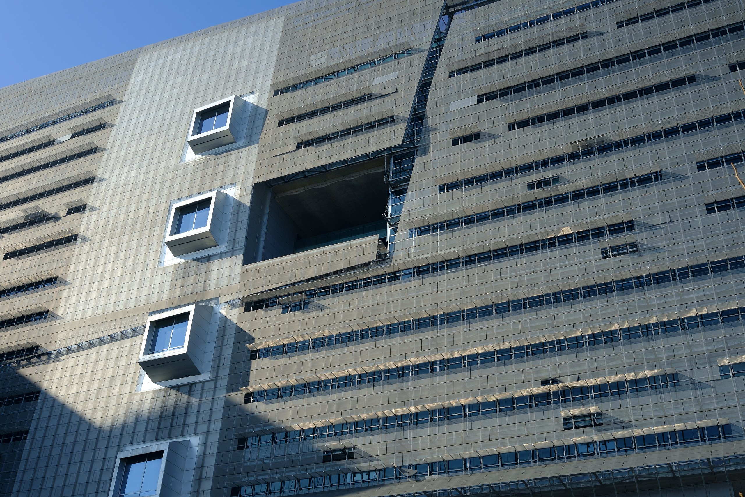
The San Francisco Federal Building
This one even annoys conservative critics as far away as Washington DC. In 2007, this was a bold experiment: Federal buildings had always been staid and boring, but architect Thom Mayne threw all conventions to the wind and vowed that if nothing else, this one would stand out.
And, well, it certainly does. So, Why Does It Look Like That? Among other things, Mayne aimed to “democratize” public buildings; for example, those huge, honking, cube-shaped open spaces that are so distracting to drivers are SUPPOSED to be distracting, so as to draw attention to the shared areas and invite public scrutiny.

The De Young Museum
Some people are just never going to get over this one; in 2005, NPR even compared the observation tower to “an arthritic thumb.”
The previous De Young building was too damaged by the aforementioned ’89 earthquake to continue, so we ended up with this 21st century design, wrapped in copper and joined by extreme and unexpected angles on all sides.
Many critics dub it a “masterpiece,” but the general public is always taking cheap shots at it whenever the museum does anything to raise their ire.
So, Why Does It Look Like That? The idea, apparently, is for the museum to blend with the park space; the copper shell is supposed to turn green with age, this natural coloring contrasting with its weird geometric angles. But right now of course it just looks brown.

Salesforce Tower
Naturally, everyone hates the new kid on the block.
Originally dubbed simply the Transbay Tower (Salesforce does not own and did not build the structure, contrary to popular assumption), this one was always meant to stand out from day one.
So, Why Does It Look Like That? Before it opened, architect César Pelli told me that the tower is meant to invoke the classic shape of an obelisk–which is actually a fairly sedate and crowd-pleasing kind of design.
If some people don’t like the results, it might just be because of the scale–or again, simply because it’s still new.
Hilton San Francisco Chinatown
Why Does It Look Like That?
Honestly…we don’t know, this one really is just an ugly building.
But you can’t please everybody.
As always, if you have any questions you can contact us directly, or throw them in the comments below. Make sure to subscribe to this blog, or follow us on social media @theFrontSteps too. And please do consider giving us a chance to earn your business and trust when it’s time to buy or sell Bay Area property. People like working with us, and we think you will too.