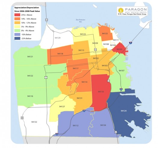
Who doesn’t love a good heat map? Especially us San Francisco residents caught in the grip of one brutally long fog song…
[Click image to enlarge.]

This heat map compares 2013 2nd quarter or 1st half median home sales prices – for houses, condos, co-ops and TICs combined – with those at the peak value time prior to the recent market recovery. Previous peak value times vary by neighborhood: typically, the least affluent neighborhoods hit peak prices in 2006 and also fell the most, percentage-wise, during the crash, falling 25% to 50%. These neighborhoods were most affected by the subprime and distressed-property sales crises. The mid-affluent neighborhoods peaked in 2007, and usually declined in value in the 20% to 25% range. And the most affluent areas reached peak values last, in the first half of 2008 prior to the September 2008 crash: Their fall in value ranged approximately 15% to 20% from 2008 peak to 2010-2011 nadir.
Generally speaking, when the market began to turn around in late 2011/early 2012, the last neighborhoods to fall were the first to recover, followed by the mid-affluent and then the less affluent areas.

The area just south of the Bay Bridge and the Embarcadero is actually 94107, not 94105.
http://www.city-data.com/zipmaps/San-Francisco-California.html#mapOSM?mapOSM%5Bzl%5D=13&mapOSM%5Bc1%5D=37.770443352285376&mapOSM%5Bc2%5D=-122.39318847656249&mapOSM%5Bs%5D=income3&mapOSM%5Bfs%5D=false